Color
Color is used in design to attract attention, group similar elements, show meaning, and enhance aesthetics. We typically begin the design process with a color palette for each map, comprised of a cohesive group of primary and accent colors. This is an iterative process. Colors will most likely grow and morph once you start designing and seeing what works together on your map. Just make sure your final map and palette are consistent and work harmoniously together. Below are a few things to consider as you define the color palette for your custom map.
Number of Colors
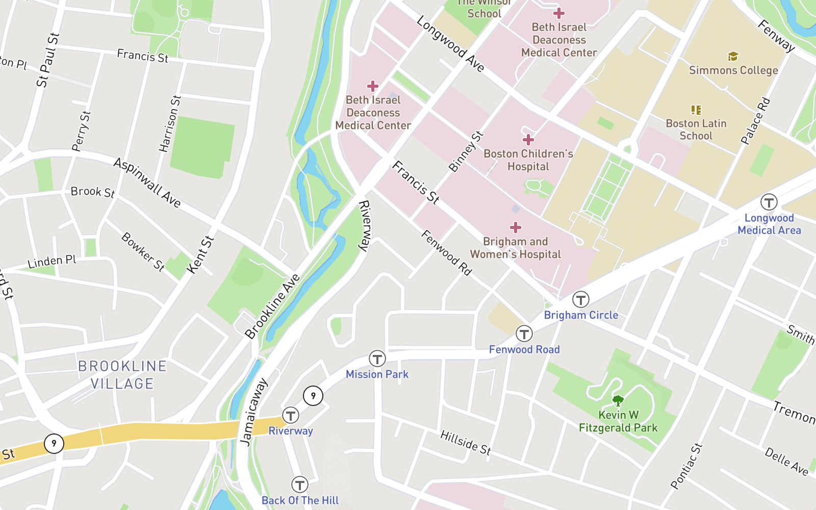
Use color conservatively. The eye can only process so much at a time, so a limited color palette is best. Depending on the complexity of your map design, between 10-12 colors is pretty standard for a full-body color palette. Also consider a significant portion of the population has limited color vision, so style accordingly.
Both Mapbox Streets and Mapbox Outdoors use around a dozen unique colors, but a variety of shades and tints.
Many conceptually similar features share the same hue value, to reinforce their meaning and create a more cohesive map.
 Mapbox Street color variety
Limiting your colors will also help with visual harmony. For example, many features related to navigation and transportation share the same blue hue: rail labels, highway shields, ferry routes, and even road casings for this purpose.
![]() Mapbox Streets blue transit icons
Mapbox Streets blue transit icons
Color Consistency
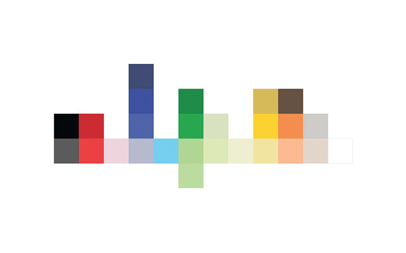
You can make subtle adjustments to your color palette while maintaining visual harmony by using the same hue but altering the color's saturation or value levels. The hue value simply represents the color of an item in the color wheel. 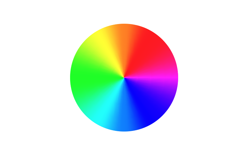
Saturation
Saturation represents the level of intensity in the color or the color's dominance. As you decrease the saturation, the hue we becomes less vibrant and the color dominates less and less. When you reach 0 saturation, no hue dominates and you end up with a dull gray color.
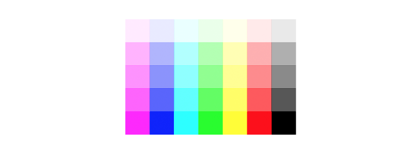
Value
Value is the dimension of lightness/darkness describing the overall intensity of light in the hue. As you decrease the value, the hue becomes darker and at0becomes completely black.
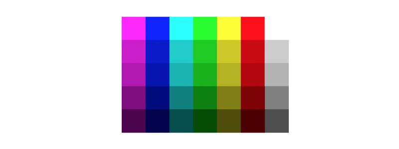
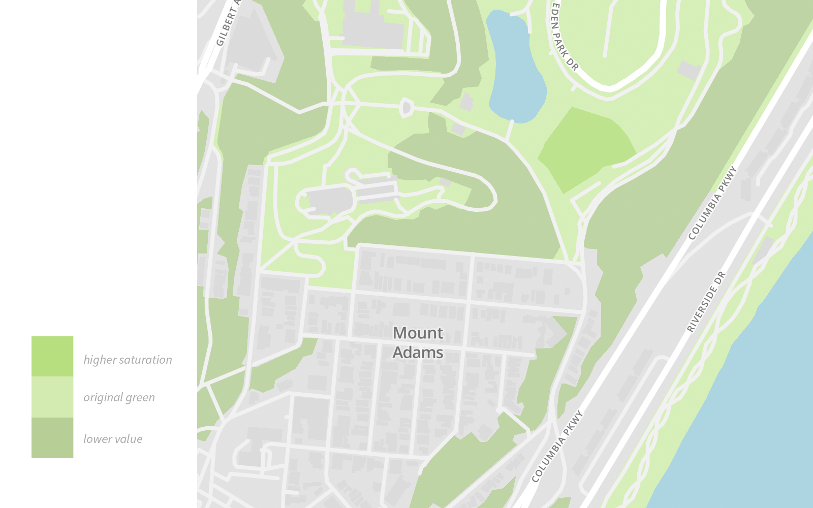
Let's say you start with a pale green from your color palette to use to style park polygons. Then decide you want to differentiate between wooded areas and grass. Taking the original green (shown below), I've create two new colors by lowering the value for a darker green and then adding saturation for a brighter. Resulting in three color variations within the same hue and harmoniously.