Iconography
The icons you use on your map typically indicate points of interest or POIs. These can be anything from libraries to cafes to museums to bus stops. The icons you use in your map should reinforce your brand and strengthen your map's brand recognition and readability.
Successful map icons must be widely recognizable even across cultures, as simple as possible, and legible at sizes as small as 11px. Creating your own custom map icons for each project is rather time-consuming, so Mapbox has created a collection of pixel-aligned point of interest icons made by cartographers for cartography. This collection of icons is called Maki.
Maki aims to be the most high quality, consistent, and comprehensive point of interest icon set possible. Maki icons are designed simply and work seamlessly with Mapbox Studio. The Maki icon editor allows you to customize the style of your icons you can add and remove these icons, categorize and style them in groups, and download them for your map styles.

Mapbox Streets icons
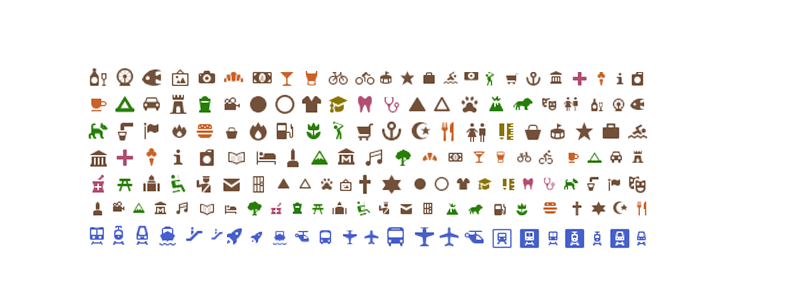
Maki icons used in Mapbox Streets map style.
Notice that the icons are grouped and style into familiar categories. For example, the food category is all orange and the transits all blue. These groupings help the viewer recognize and find POIs more easier as they navigate the map.
![]() Styled and categorized icons each with a light stroke to pull them slightly from the background in the Mapbox Streets map style.
Styled and categorized icons each with a light stroke to pull them slightly from the background in the Mapbox Streets map style.
Mapbox Satellite Streets icons
Mapbox Satellite Streets however deals with a Satellite imagery layer, and this requires a different treatment of the icons to ensure they are legible over varying terrain and urban landscapes.

Maki icons used in Mapbox Satellite Streets map style.
![]() Simple white icons with a dark gray stroke that blends with varying terrain for Mapbox Satellite Streets map style.
Simple white icons with a dark gray stroke that blends with varying terrain for Mapbox Satellite Streets map style.