Maps and data visualizations
Data visualizations can be expressive, powerful opportunities to use maps to tell stories and understand information. A compelling basemap sets the scene and deepens the relationship between the what and the where of the information narrative. When uncovering spatial patterns or getting actionable insights from data, seamless integration between the map, map and interface are key. The use-case is comprehension, and helping the user see the relationships in the data is the ultimate goal.
Consider the following as you co-design your map and data visualizations:
- Explore or explain your data. Exploratory data visualizations are appropriate when you have tons of data and you’re not sure what’s in it. Exploration is generally best done at a high level of granularity. If you oversimplify or strip out too much information, you could end up missing something important. Explanatory data visualization is appropriate when you already know what the data has to say, and you are trying to tell that story to somebody else. You know the story and therefore you can design to specifically accommodate and highlight that story. Edit the data by deciding which information stays in, and which is distracting or irrelevant and should come out.1
- Design a three-dimensional visual hierarchy. Often times we see data visualizations that seem to plop the data onto the map. The key is integration, you want the map and data to work together not against each other. Color, value, and saturation are key for these relationships. Start with a strong, limited color palette with high contrast. If you start with the Light or Dark style, alter the hue to fit your brand, start small with line widths and ease shapes from
0%to100%opacity. The goal is to produce a three-dimensional effect in which certain key features appear to rise off the map's two-dimensional surface. - Categorize similar data. Early in the design process, identify the best and most accurate way to sort and categorize your data. Depending which technique you plan to use for displaying your data on the map, choropleth, heat map, etc., determining the appropriate groupings for your data will keep your data honest and provide valuable insights.
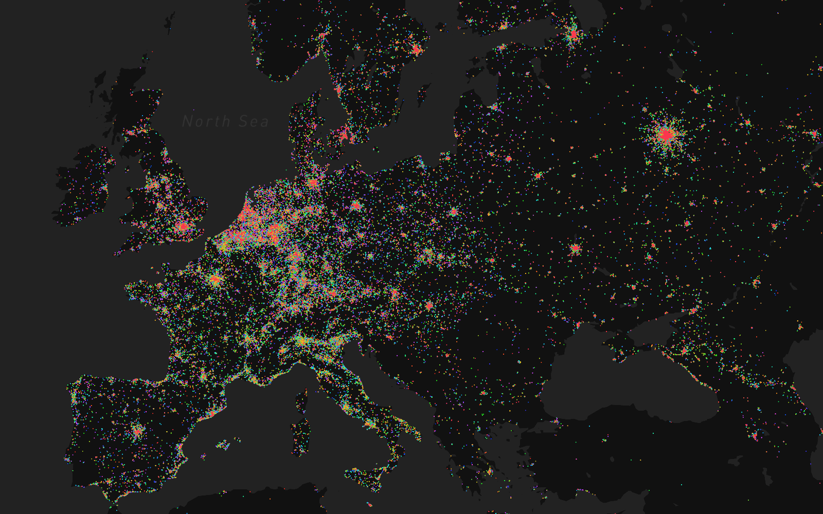 Visualizing Eurovision Shazam tags with Mapbox GL
Visualization styles
- Dot density — A map style that uses a dot or other symbol to show the collective presence (density) of a feature or phenomenon. For example, showing busy intersections or high/low volumes of activity within areas.
- Choropleth — This is a thematic map style that applies shaded color or pattern textures in proportion to the intensity of the data being displayed on the map. For example, showing population density or per-capita income.
- Hexagonal binning or hexbin — This map style is good for showing general themes over a geography. It is less granular than dot density and not constrained by boundaries as is the case with choropleth maps.
- Heatmap — This map style enables the map viewer to perceive density of points independently of the zoom factor. It is the least constrained of them all because it does not correspond to geographic bounds.
Custom data
There are a variety of ways to add data to your map. First, you can upload data directly into Mapbox Studio, this will convert your data into a web and mobile ready, highly performant tileset. Your custom tileset will be accessible in any Mapbox Studio style. Another method is to create a dataset with your custom data. This is done in the dataset editor, there you can add data sources, draw new data points, lines, and polygons, combine various data sources and maintain your raw data. Once you are done augmenting your data, you can export it as a tileset and add it to your map for styling. Choosing a tileset or dataset depends on if you are planning to use the data immediately in your style or if you plan to enhance or manage the data over time.
The final way to add data is with Mapbox GL JS which allows you to add the data dynamically. Check this example for adding live GEOJSON data to your map style. Find out about How Uploads Work to learn the differences between tilesets and datasets, how the upload process works, techniques for uploading, and resources for getting started.
Recommended reading
- Dots vs. polygons: How I choose the right visualization
- Light and Dark maps for data visualization
- Data underneath: Labels on top
- Visualizing Eurovision Shazam tags with Mapbox GL
1. Designing Data Visualizations by Julie Steele, Noah Iliinsky ↩