Contrast
Human beings are wired to notice difference. This is what makes contrast such a powerful design principle in map design. Contrast attracts attention and draws the eye. This separates features from the surrounding elements and can instantly create emphasis and interest. In addition to attracting attention, contrast establishes boundaries between elements.
Color Contrast
Keep a healthy amount of color contrast in your map style to keep it vibrant and legible. You don't want too much contrast or your colors could scream at the viewer. If your colors are too muted they may start to blend together. Increase the saturation of your colors to push the contrast if necessary.
 Low contrast map with soft, less saturated blue, greens, and a baseline gray for labels.
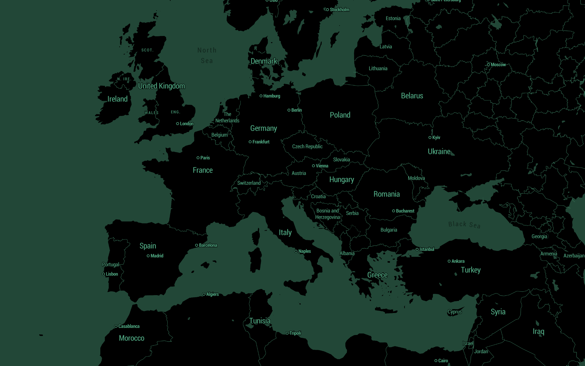
 High contrast map with vibrant more saturated blues, greens, and a darker gray for labels.
Contrast and readability
The amount of color contrast in your map style can affect your map's readability. For example, the text labels and iconography could either blend into the background elements or stand out in a glaring way. Keep this in mind as you are working with your map's color palette. A healthy amount of color contrast in your style will help those with low vision, color blindness, or worsening vision better see and read the text on your map. Make sure you have a fair amount of contrast between elements, but not too much.
Visualizing data
Many maps use bright, primary colors against a stark, muted background map to highlight important elements or show data visualizations. As long as there is simplicity and harmony within your color palette this technique works well and can be super easy to customize or alter with other color schemes. Decimal is one such style. This minimalist map style that works great as a base for data visualizations or as a backdrop for your next game.
 Decimal map style, Tristen Brown 2017