Hierarchy
Hierarchy helps viewers focus on what is important while identifying patterns. A strong, visible hierarchical a system is one of the most effective ways to increase comprehension. Color and scale are two major design elements you want to finesse to leverage the visual hierarchy of your map style.
Color
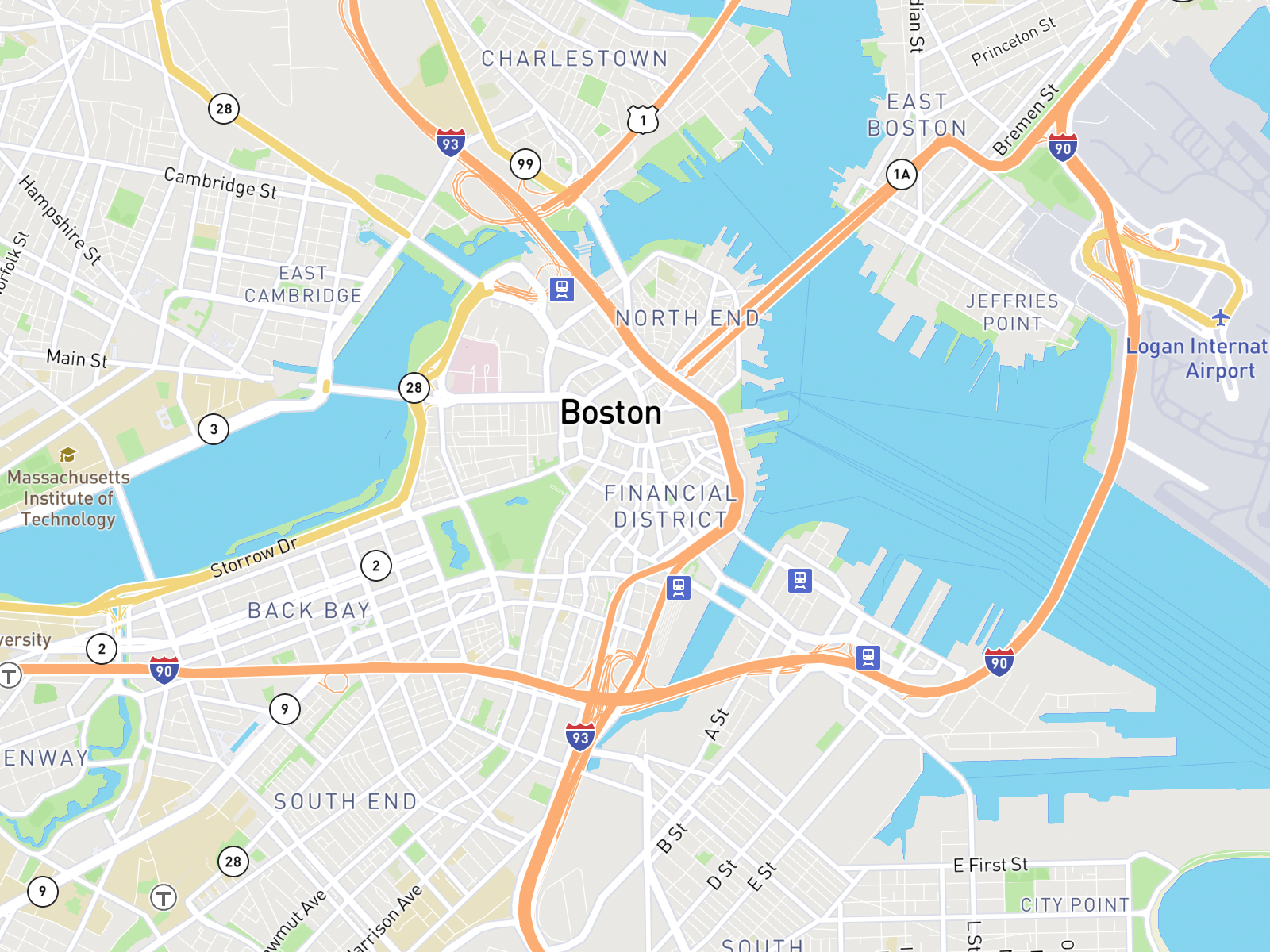
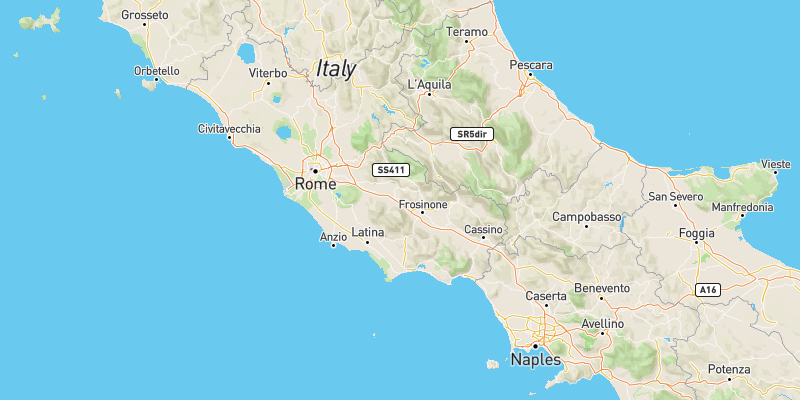
Use color to differentiate and show a hierarchy of importance between map features. The road networks in Mapbox Streets while using the same width are distinguished by color to show hierarchy. Motorways are styled orange, high performance roads are yellow, and primary roads are white while maintaining the same line width. The next level of roads are styled with a thinner width and less vibrant white are recedes more into the background, still noticeable but docile.
Scale
Scale is both the overall size of an object and that object's size in relationship to other elements around it. Identifying a system of sizes to rank map features like labels or road widths will help to indicate the hierarchy of these features.
Typographic hierarchy
This system employs both scale, stylistic elements (like font weight, i.e. light, normal, bold, etc.), as well as treatment (like uppercase, lowercase, italic, outline only, etc.) to establish an order of importance. This hierarchy will guide the viewer easily and quickly to the start and end of information, whilst enabling them to isolate certain information based on the consistency of use in the style throughout.
Below is the hierarchy system for the Blueprint map, which uses a variety of techniques to indicate importance and differentiation by forming visual patterns for the user to better comprehend the map style.
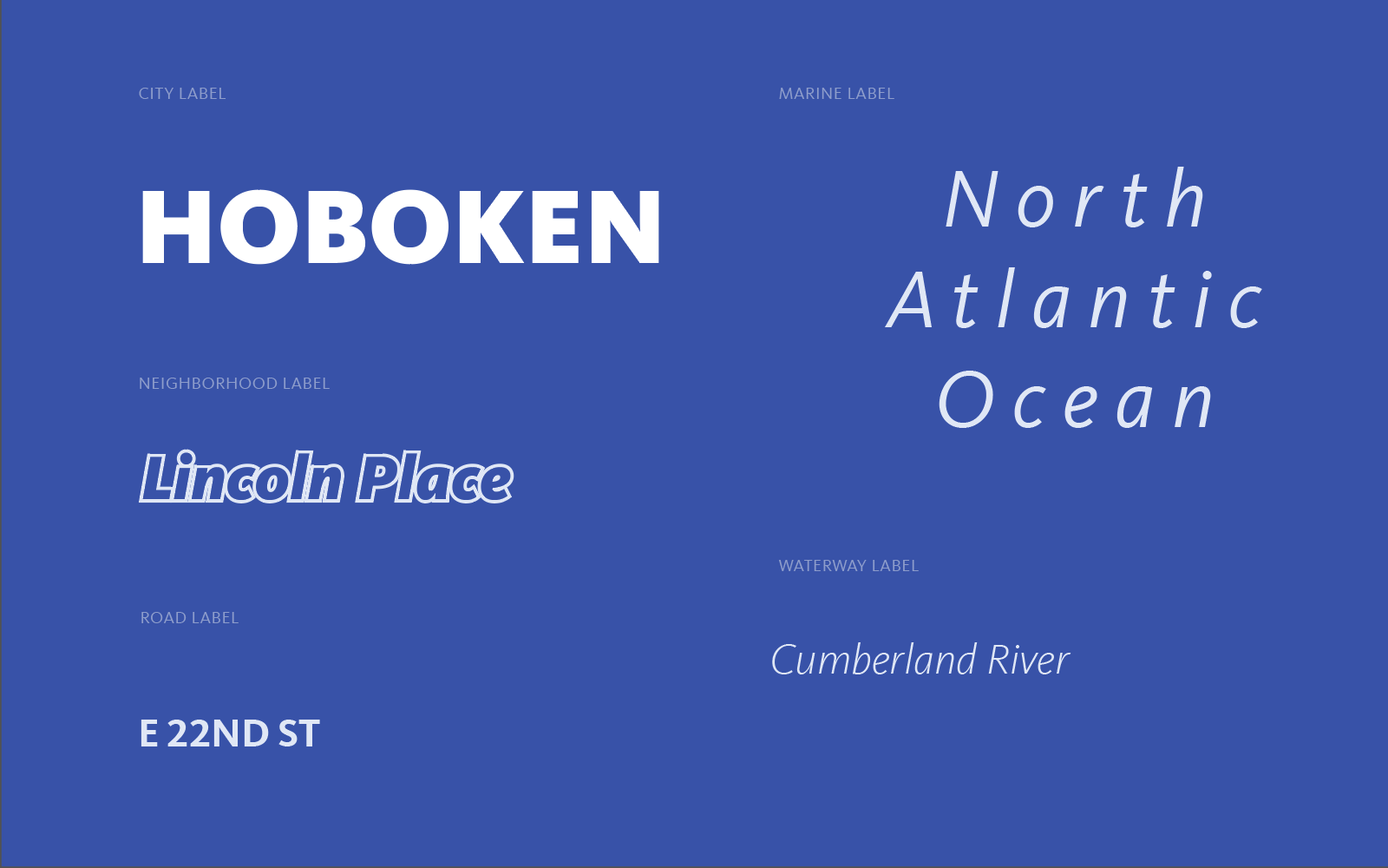 Typographic styling of place, road, marine, and waterway labels in the Blueprint map style.
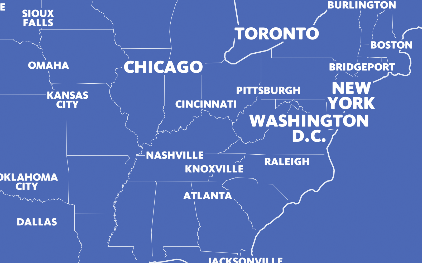
Typographic hierarchy structured by city size.
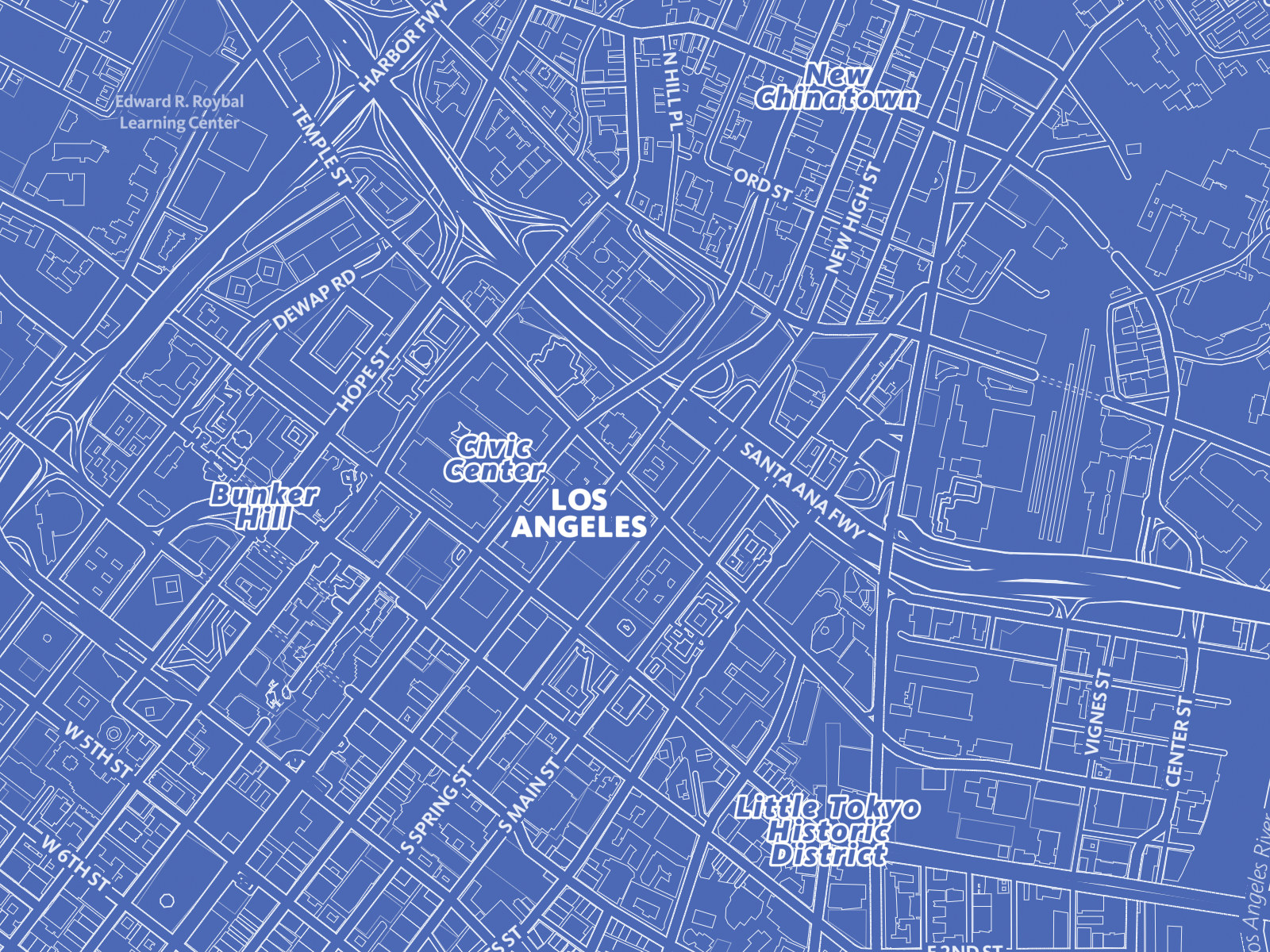
Differentiation in typographic treatment for city and neighborhoods.
Here in Mapbox Streets, the scale variation is more subtle overall but your eyes are lead around the map by order of scale in the place labels.
General purpose maps
Maps that style a variety of physical and cultural features, like terrain, roads, transit stops, and points of interest (POIs), are general purpose maps. They show hierarchy differently than thematic maps which normally feature a single attribute or the relationship among several attributes.
For general purpose maps, features should not overpower each other and should essentially lie on the same visual plane. Here hierarchy is usually more subtle and the viewer brings elements to the forefront by focusing attention on them.
 Mapbox Streets - general purpose styling low hierarchical focus.
Thematic maps
Thematic maps are typically emphasize specific feature or location to show prominence. Oftentimes, the theme itself is more important than the geographic context. Hierarchy then starts to present itself in the grouping of features as stylistic elements by color, texture, scale, and/or style.
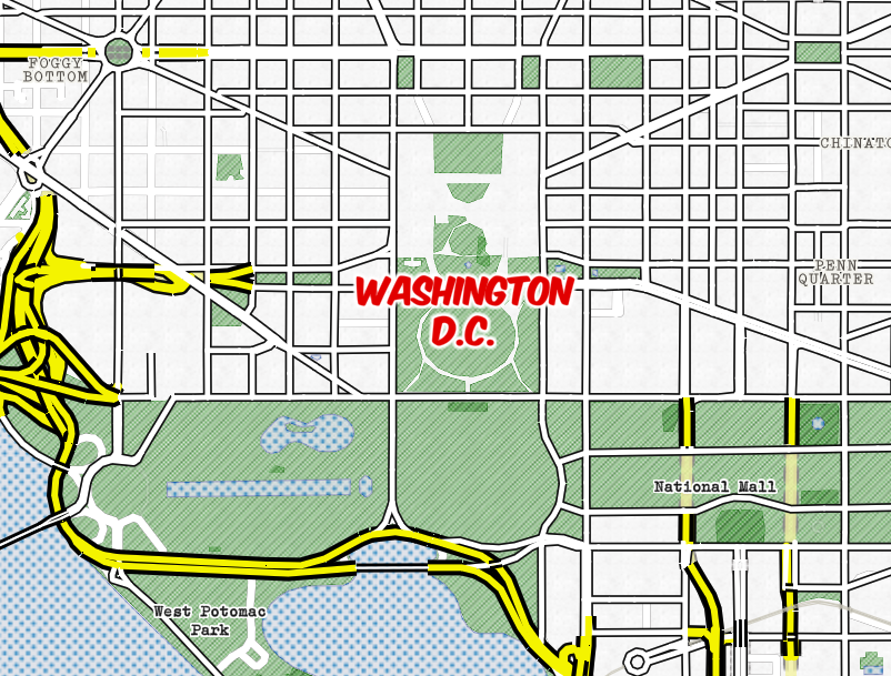 Whaam! map style - thematic styling with high hierarchical focus.