Typography
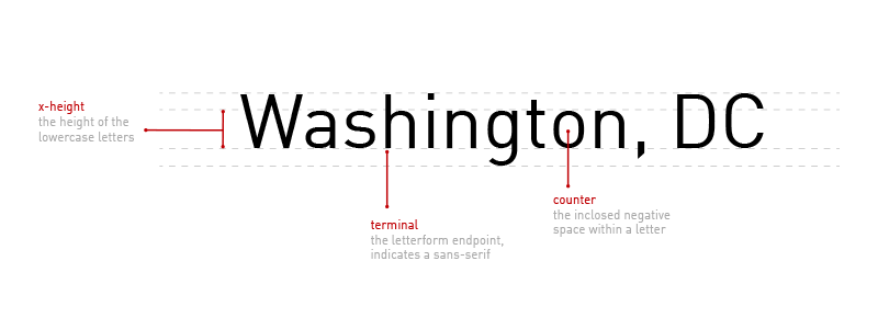
Typography is one of the most important design elements of your map and can make or break the readability of your map. Labels, which represent most of the text you find in maps, are often only one to three words long and are displayed at very small sizes. With this constraint fonts with taller x-heights, open counters, and no serifs usually work best on maps.
Your brand's font may or may not work for you map style. In that case, choose a font directly from Studio that both works for your brand. Consider the font's quality, readability, and personality.
Quality
High quality fonts offer a variety of styles: Italics, Caps, Caps Italic, and Small Caps, weights: Ultra Light to Ultra Black and everything in between, and widths: Condensed, Narrow, Normal, Mono, and Expanded, just to name a few. You can leverage this variety to easily differentiate between labels and show hierarchy in your map styles.
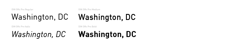
The primary font for Mapbox maps is Din Office Pro for map styles used in the Medium, Italic, Regular, and Bold variety. We use Arial Unicode MS as our fallback font to make sure your map has complete language. Arial Unicode MS is mapped to the standard Universal Character Set which supports a wide range of global languages.1 Most professional fonts do not create character to support all languages, so a unicode fallback is necessary to ensure global coverage.
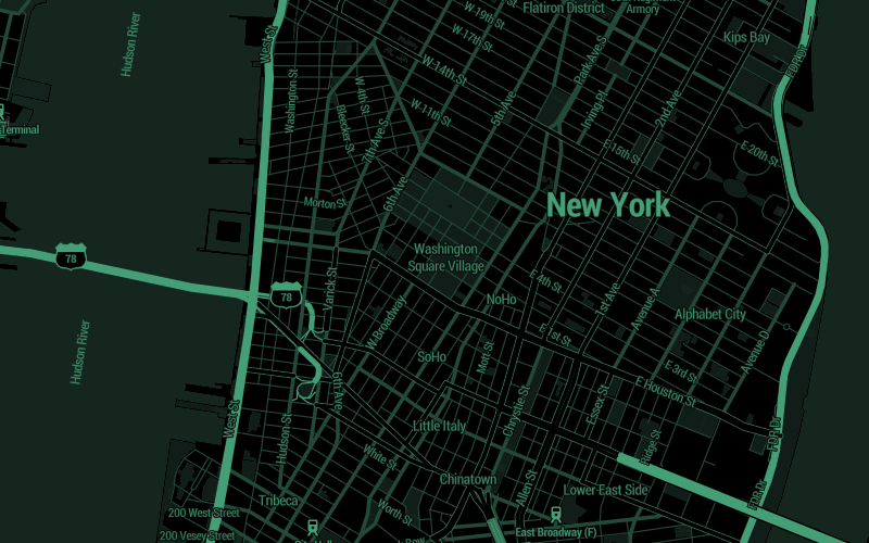
Mapbox Streets
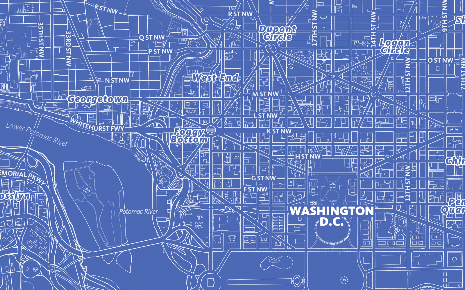
Blueprint
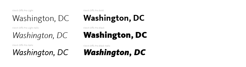
The Blueprint style is very minimalist and is primarily driven by one hue and one superfamily typeface. The typeface is FF Kievit a typeface that explores the synthesis of the sans serif form to the structure and proportions of a traditional serif font. The family spans nine weights and includes small caps, true italics, and multiple figure sets – everything necessary for creating sophisticated typographic systems.2 This typeface ships with Studio and only employed Light, Light Italic, Italic, Bold, Black, and Black Italic variations.
Readability
Readability is about arranging words in a way that allows the readers eye to access the content easily and intelligibly. This skill takes time to honed, but here are a few stellar ways to greatly enhance the readability of your maps:
- Diversity of label classifications. Design distinction into the classifications and properties available in your label data. For example,
place labelsoffer classifications of cities, towns, villages, neighborhoods, and more. Create a system of treatment to distinguish this diversity. - Diversity of label colors. This can be subtly enforced by altering the
saturationorvalueof the same hue as shown in the Color section. This works particularly for styling points of interest (POIs) to give distinction to categories of points, like cafes or schools having distinct colors. But keep it moderate. - Control the spacing. Letter spacing (often called tracking) adjusts the spacing between all the letters in a piece of text. This can help to make your labels look more open and inviting. Tiny type is made more readable by opening the letter spacing a bit. As with everything, use caution tracking is often wildly overdone. Also monitor your label width, this determines how many letters fit on one row before a line-break occurs. Something to be mindful of when working with Bold, Black or just more heavily typefaces.
Text halos
Text halos bring your labels to the foreground visually and help prevent background elements, such as roads, waterways, etc., from diluting the comprehension of your labels. The specific treatment here will vary from design to design but you want to pull your labels to the foreground without making the halos obvious.
Take a look at the before and after below showing a small halo effect. Notice how much easier it is to read the text after applying a small touch of halo.
 Before: No text halo applied to labels
 After: With text halo applied.
Personality
The personality of a typeface speaks to the voice and energy it exudes. Major typeface styles are sans serif, serif, and script however sans serif fonts are popular on the web and mobile because of the lower DPI (dots per inch) on screens. Three main types of sans serif fonts: humanist, transitional and geometric. Humanist sans-serif typefaces mimic handwriting and evoke a feeling of warmth and personality. Transitional sans serif typefaces have strong strokes and are more upright and uniform. They typically have an unassuming, authoritarian and modern personality. Geometric Sans Serif typefaces use geometric shapes to form the backbones of the letters, which creates a strict, objective, and universal feel.
The fact is the details of a typeface–such as contrast, proportions and angles–can have a big effect on its emotional characteristics. To help you decide, here are five questions you should ask of any typeface you’re considering…
- Purpose and mood?
- Serif or sans serif?
- Collaborative or contrast?
- Creative or classic?
Take a look at some personality of these fonts used in a few of our designer map styles.
Roboto: Modern yet approachable
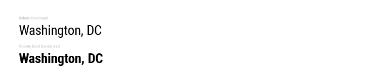
The map style Decimal uses simple dark colors with a splash of vibrant details. The fonts used are Roboto Condensed and Roboto Bold Condensed. Google describes Roboto as "modern, yet approachable" and "emotional". Condensed fonts grab your attention due to their slender, high-reaching vertical real estate. This font pairs very nicely with such an extreme color palette and feel overly technical with the terminal, computer whiz theme.
Roboto Mono & Old Standard: Modern classic
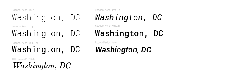 North Star uses Roboto Mono in a variety of weights and styles. While "modern, yet approachable" the monospace format which have the letters and characters occupy the same amount of horizontal space similar to the lettering that would come from an old-fashioned typewriter. North Star pairs this font with gentle touches of Old Standard TT. Another modern, yet classicist style font but with serif evoking an older, classic feeling of the late 19th century. This combinations promotes the old modern mix of this map style.
Magda Clean Mono: Nostalgic grunge
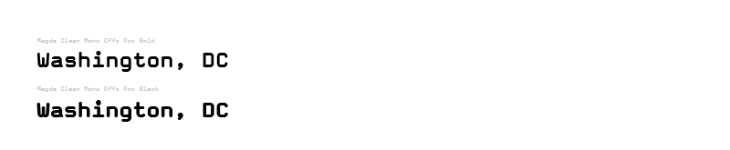
Desert planet uses Magda Clean Mono Offc Pro Bold and Magda Clean Mono Offc Pro Black, both available in Mapbox Studio. Another monospace, this font has a boxy typewriter look giving it a throwback appeal. There is also a grungy, edginess to the wide letters and the letter spacing added to these labels. This font has tons of personality and adds a strong narrative to this deserted, almost dystopic map style.
1. https://en.wikipedia.org/wiki/Unicode_font ↩
2. https://www.fontshop.com/families/ff-kievit ↩