Legibility
To be legible is to be easily read which is of utmost importance in map design so the user can easily understand how to navigate the represented space. Legibility of most map features depends on color and size, and in addition to labels and text, can be iconography too. Icons must be designed simply enough to recognize at small sizes and offer good contrast against the background.
Iconography
For select cities and countries, our Mapbox Streets icons feature local public transit icons and highway shields to help orient the user by visually connecting the map to their environment. We redesigned original symbols, simplifying the details and exaggerating the form while balancing good pixel-alignment and visual parity with the originals.
![]() POI icons, highway shields and rail icons used in Mapbox Streets.
POI icons, highway shields and rail icons used in Mapbox Streets.
![]() Mid-zoom view of POI icons and highway shields in Mapbox Streets.
Mid-zoom view of POI icons and highway shields in Mapbox Streets.
Text
A good choice of font with high x-heights and suitable at smaller sizes, color contrast for visual separation between foreground and background, as needed letter spacing, and the use of text halos can vastly improve legibility in text labels.
 Mapbox Outdoors showing typographic variations in color, contrast, scale, and spacing in this cityscape.
Proximity
The proximity of map elements to each other is also important to the overall legibility. Proximity calls for related items to be grouped visually, creating less clutter and making for a more organized layout. At times you will have features very close or overlapping your map, as you style create a balance by using lighter color saturation, softer opacity, and substantial contrast text and text halos if text is involved. Balance is key.
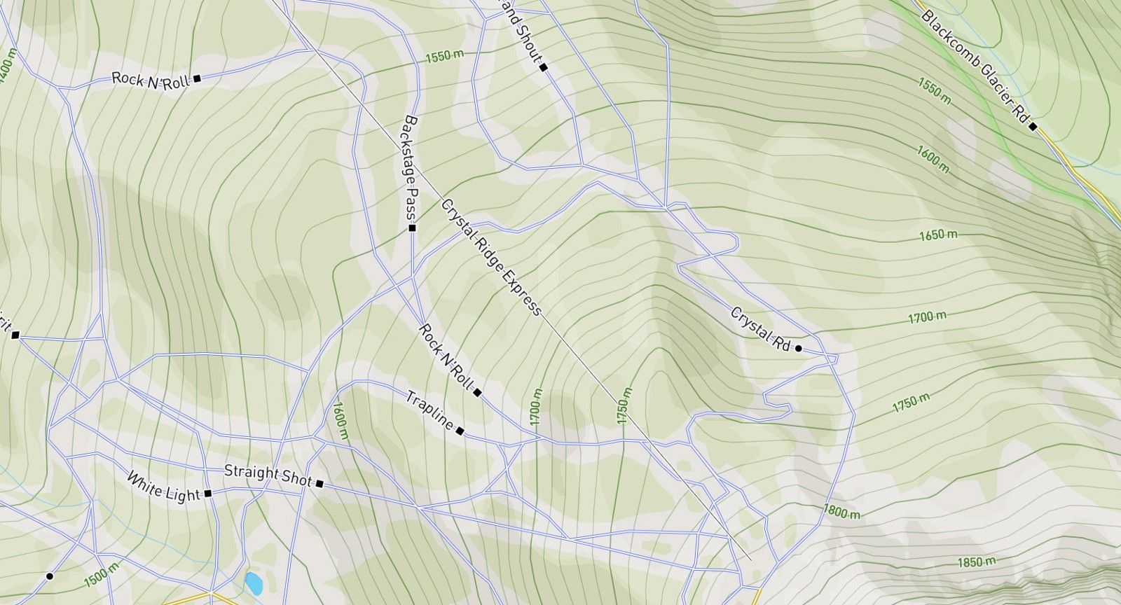 Mapbox Outdoors styles ski paths in Whistler, BC over contour lines and hillshades using color and style to differentiate.